iPhoto 6: general preferences
Let’s start with the pettiest list of gripes I could possibly conjure up about iPhoto, shall we? Good. We’ll begin with the preferences dialog. More specifically, we’ll begin with just the General pane of the preferences dialog, since I have an illogical fear of long weblog entries.
The application preferences window is far and away my favorite place to visit when I’m exploring a new app. Preferences give you an idea of what a piece of software is capable of; and in new versions of familiar software they can show you what’s new, what’s changed, and what’s been removed.
The addition of a user-facing preference is a pivotal juncture in an application’s development: they are points long-debated by a good dev team and too eagerly included by a poor one. I say “user facing” because I’m not addressing hidden preferences here, nor interfaces to extensibility like AppleScript (which are, in effect, the preference mother lode). Those are for power nerds, and ordinary user-facing preferences are for ordinary users. This is why I have a problem with some of iPhoto’s preferences: they just aren’t ordinary enough.
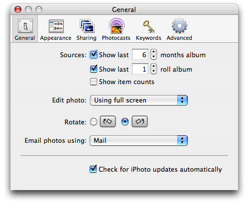
iPhoto’s General preference pane is over all pretty quiet, fairly unassuming, and difficult to poke fun at… at least from the top. You can’t argue with a preference as to whether you should edit photos inline, in a new window, or in full-screen mode; that’s a real decision and a matter of personal preference. So we’ll start from the bottom.
Check for iPhoto updates automatically? Huh?

Updates to Apple software are handled through the system Software Update utility. This utility runs itself at regular intervals, alerting the computer administrator when there are updates to install — iPhoto updates included. For iPhoto to have its own internal update mechanism (which this option hints at, though it may just be an interface to Software Update) would be ridiculous. Plainly stupid is probably a better term.
Moreover, Apple software updates (and indeed any changes to the Applications folder) can only be performed by administrators. This particular preference is available to all users… making it a big tease to those without admin privileges. Redundant and mean spirited, how’s that for a two-hit combo?
Next up (if we’re moving up) is the choice of email client to handle your emailed photos. The feature is pretty simple: select photos, hit ‘Email’ in the toolbar, and the photos are pasted into a new email at an appropriate size. You can even choose to include titles and keywords. Neat.
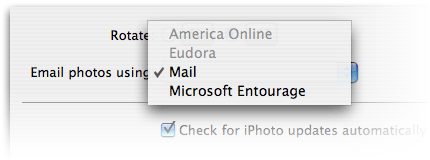
So why do we have to choose which email client we want to use? Is there not a default client handled by the system? You know, the one that responds to mailto: URLs? Sadder still, the popup list is hard-coded with apps that might not even be installed on your system. Hmmm… don’t wanna send these emails from the application I usually send email from, not today… how about AOL? Shit, turns out I don’t have it installed.
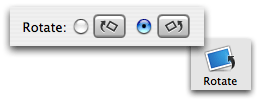
And let’s not forget the rotate button.
The first thing you might notice about the rotate buttons shown in the preferences dialog is that they differ a little from the button in iPhoto’s toolbar. Their appearance is a holdover from iPhoto 4; two years later this still hasn’t been updated.
Putting aside little graphical nitpicks like this for a second, what good is this preference? What good is this ‘feature’ of image rotation? In an effort to reduce clutter, iPhoto’s toolbar sports only one rotate button, and that button rotates in the direction you’ve determined in your preferences. You can hold down the Option key to quickly spin the opposite direction if you’re so inclined, or you can access either direction from the Photos menu in the menu bar. There are even keyboard shortcuts you can memorize for all your rotating needs. So why in the hell does this preference exist? Either hard-code one single direction, still allowing those other three ways to rotate contra, or give us two buttons in the toolbar. Preferences are a cop-out.
The saddest part of these three bugs (which have been filed in the appropriate manner with Apple, yes, stop emailing me) is that they’re so pathetic. They’re oversights, quick band-aids over sloppy UI, and coding errors. And I honestly expect better. This is paid software from a pioneer and modern giant of the computing industry, and it’s full of crap. To paraphrase Gruber, “at least it’s better than anything Microsoft could produce” is not high praise.