She would
- Anna
- Which would you prefer, given the choice. A good body or a big dick?
- Jess
- Good body, definitely. I’d look weird with a big dick.
It’s always a little embarrassing when you are moved to write a piece because something in particular was bugging you, only to get so caught up in the moment that you forget to mention said thing.
Well this is it.
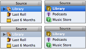
Take a look at iPhoto’s source list compared to, say, that of iTunes. Really look. They aren’t that different. For those in the audience lacking familiarity with either of them: iPhoto is in the left column, iTunes in the right. The bright blue highlight indicates that the selected item has keyboard focus —move up and down with your arrow keys as you will— while the more muted blue-gray highlight indicates that while that album is still selected, the keyboard focus is elsewhere. Probably amongst the photos of that album.
For now, disregard the slightly lighter blue gradient of iPhoto’s selected album. Disregard the column header being just slightly taller. Even disregard the bank of pixels around the column resize handle being slightly darker than the column header it’s sitting on (and that’s asking something). What’s different?
First and foremost, iTunes’ currently-selected item’s label is bold. This isn’t an emphasis thing, this is a readability thing. Because a dark background imposes itself upon white text much more than the other way ‘round, it appears slighter and is more difficult to read. Bolding the text is just another tool in the fight against said imposition, and iPhoto fails to make use of such a cheap and effective tool. That’s just the way it is. But there’s something else.
Eighteen months ago I wrote about Safari’s then-new CSS text-shadow support and the abuse thereof at the hands of goofball designers. Actually, the post was in praise of its use in situations where it served a real purpose; that is to say I praised its use where it served design, not decoration. The thing that makes the drop-shadow a great design element is that it can increase text-to-background contrast and make text more readable. This is especially the case where the background color is mutable and text is not. If you don’t know what I’m talking about, take a look at the white text and drop shadows in the opening credits of Lost next time you see it.
So by now you know what I’m really trying to point out in iPhoto’s source list. The currently-selected album doesn’t have a drop shadow, while iTunes’ playlists do. Now I have young eyes, and unlike every other member of my family I’m blessed with 20/20 vision, but it’s actually difficult to read the word ‘Library’ there in the bottom-left quadrant. Light background, white text… low readability! Who’d’ve thunk?
I know I’m flying off the handle here, the eloquent readership of this most prestigious of blogs is more than vocal enough on the topic. But like most of the complaints I’ve aired about Apple’s UI design of late, this isn’t a deal breaker. It’s just evidence that the attention to detail is gone, and that’s fucking sad.