Yikes
Redesigning in Public™, mind the wet paint. Reload as necessary.
I’ll keep this brief. Things that are cool:
The recently–released Salling Clicker 2.0 is an impressive step forward. It adds a great deal of sensible and powerful options, and makes adjustments to Clicker’s overall behavior and interface that can only be described as… well… good.
Unfortunately for Clicker, Bluetooth is a real drain on battery power; so much so that I’ve taken to just leaving my Clicker menus unpublished. While this technique saves on battery, it really defeats the purpose of having a remote control for you Mac.
Late night hack’n’slash action deep within the bowels of my Movable Type templates means I’ve ‘mini–tabbed’ the main navigation bar of the site. There is more to come, no doubt, but for now I feel I must sleep.
In the interest of having more than two sections to my site, I’ve added a links department. It’s more–or–less just a little recognition for all the people that make my time online entertaining… without going to the trouble of starting a blogroll. It’s currently unstyled and completely unattractive, but it’s a start. That’s why we call them redesigns. Reload at will.
On a whim, I downloaded and installed Henrik Gemal’s Acronym Plugin for Movable Type; simply because I think auto–describing acronyms is great.
Of course, it didn’t stop there. I made a few changes to the plugin so that it would write <abbr> tags instead of <acronym> tags; and while I appreciate that IE/Win doesn’t support <abbr> tags, I don’t it as a problem for its users. It’s more like a perk for people using better browsers. At the same time, given that most of todays ‘acronyms’ aren’t really acronyms at all (acronyms form a pronounceable word… like QANTAS or ANZAC) and the <acronym> tag is looking to be stricken from XHTML 2.0, I think it’s high time we embraced our <abbr>eviated friends.
Again, it didn’t stop there. I searched my MT archives for <acronym> tags, dutifully removing them and filling in the gaps in my abbreviations database. It’s taken far longer than it should’ve, and it really didn’t need doing in the first place, but god damnit it was worth it.
Mónica Calvo of Eendar (also of Organic Fields) produces some beautiful illustrations, some of which make it to her downloads department (see: descargas) for use as desktops.
There’s little more to say than, well… beautiful.
For reasons unknown, the W3C markup validators (both the standard and beta versions) are currently experiencing technical difficulties. And when I say ‘technical difficulties’ I mean they’re failing everybody.
Go with the WDG’s HTML Validator until further notice.
After much tinkering/tooling and much convolution introduced to my style sheets, we have a little something new! If you’re in any part of any department at any time, you’ll notice that not only does the mini–tab and header graphic reflect that fact, but the sub–mini–tab–tab will tell you exactly where you are within that tab. Confused? Awesome.
The abridged version? The hierarchical structure of this site is now visually represented by the navigation toolbar, it is no longer merely implicit.
Yes, I appreciate the fact that the only two sub–navigatory links available at this very moment are ‘view this week’s entries’ and ‘subscribe’ (both within the ‘weblog’ department), but that is due to grow and change without notice. The important thing is that I made the subscriptions page visible to those who never knew I had RSS feeds. Browsers currently tested to be displaying this website perfectly (or close enough to be forgivable) are:
Browsers currently posing choking hazard to small children include:
And now I must sleep, for tomorrow is Father’s Day. And that means it’s “Help Your Parents Renovate Their House Day”… if only because it’s implied I should do something nice for Dad on his special day.
PS — the W3C Validators are back to normal. Go about your business as usual, please.
For reasons beyond the scope of even my comprehension, I just tweaked my little “serve capable UAs the right MIME type” PHP script to include the W3C and WDG validators. While I was at it, I figured I should use the xml-stylesheet PI everybody’s been harping on about, too.
Yes, it’s purely a geek vanity thing, like front and rear spoilers on a Hyundai Excel. Yes, only those who enjoy reading the validators’ verbose output would find this even mildly interesting. Yes, I appreciate that all this code–monkey rigmarole technically constitutes browser–sniffing. Yes, I know that I’m a hypocrite. And yes, if you can find a spoon, feel free to eat my ass.
Buy your Dad a pair of socks for Fathers’ Day and you’ll probably never see them again. Buy him a jar of chocolate–coated almonds and you might just get to taste a couple. Buy him a case of internationally acclaimed beer and you might find yourself downing six to eight of them yourself.
Did I mention my Dad is the greatest?
Earlier tonight I was introducing Fiona to the wonders of Mozilla Firebird, since IE recently became incapacitated on their Win98 box. That is to say that Internet Explorer Just Didn’t Work™, and they needed a replacement. In the tradition of Joe Clark’s ‘How to explain validation to someone who can barely use a computer’ I’ve decided to transcribe the conversation between myself and Fiona… for posterity at least.
- Chris
- Well, we can update your version of Internet Explorer to version 6, if you like. Or you can try Firebird.
- Fiona
- Is Firebird the one you use at home?
- Chris
- On my PC, yeah.
- Fiona
- So what’s so good about it?
- Chris
- It blocks popup ads, for one.
- Fiona
- You’re shitting me. Really? That’s awesome!
- Chris
- Yeah. And it has a little Google searchbar up in the corner. You can just type in whatever you want to search for without going to Google first. It has tabbed browsing, too.
- Fiona
- Which is…
- Chris
- If you see a link you want to look at you can control–click on it and it’ll open it up in the background. It just means you don’t have to look at it right away, and it’ll be all loaded–up and ready for you by the time you want to look at it.
- Fiona
- That sounds OK… I guess I’d have to see it in action to understand what you mean, though.
- Chris
- Matt tells me it’s revolutionized the way he looks at porn.
- Fiona
- Oh, it’s obviously fantastic then.
- Chris
- Damn straight.
After installing Firebird and tweaking of the toolbar layout a little (Chris Cook’s ever–so–squeaky Luna theme eases the transition for the IE–dependent, visually at least), I’m glad to say Fiona’s family are now firmly pro–Mozilla. Having her IE Favorites automatically imported into the bookmarks pane was a big plus, and so was the file size — the IE6 installer is an “11Mb to 70Mb” download… something she wasn’t going to attempt over dial–up. Firebird’s 7Mb zip was comparatively astounding.
So that’s three meatspace IE–to–Firebird conversions I can attribute to my name now, with only a few hundred to go. I should probably target my parents next… and steer them away from the vulnerability–laden Outlook Express while I’m at it. Until next time, I’ve been your host, Chris Clark; upgrading browsers for the people I love… one box at a time.
Without warning, our refrigerator broke down some time during the last few days. The light comes on when you open the door, so it’s not “broken”, per se, but it sure as hell ain’t doing its job. We’re not exactly sure when it quit, but we do know the food is still cold… enough.
Cold though it may be, the contents of the freezer are defrosted, so I have taken it upon myself to consume my stores of meat before they go bad. The three beef schnitzels for lunch weren’t so bad, but the pound and a half of chipolatas for dinner posed a challenge. I feel like a greasy, bloated, drowsy–ass, beef eating machine.
I truly pity the fools stuck on that ‘no carbohydrates’ diet — no man was meant to eat this much meat in one day. Tomorrow I start on the mince, followed by the fish, followed by the vegetables, followed by the pastries.
Reuters, via MyAppleMenu:
In an effort to spread the use of its technology, Microsoft Corp. said on Monday it will open the specifications for its video compression technology, which would allow other companies to make products based on its technology. The world’s largest software maker, which launched its latest video and audio codec, or format, Windows Media 9 series, in January, said it submitted the video compression technology to the society of Motion Picture and Television Engineers on Monday for review.
This makes me happy. Why? Because it tells me that Microsoft is finally starting to ‘get it’. Admittedly, it’s a rather desperate attempt to push widespread adoption of Windows Media 9 codec, but the key is that they’re doing it nicely. They aren’t cramming it down peoples’ throats, they aren’t cutting off the air supply from anybody with a competing codec, they’re opening themselves up to some friendly competition.
Nobody likes a tyrannical monolith… but a big friendly giant is A–OK.
I know you already know, but Tierra Entertainment is doing their bit to revive the ailing adventure genre… by retooling classic Sierra games.
I am quite literally speechless; these games are institutions in themselves. I still have my original copy of ‘Quest For Glory II: Trial by Fire’ and I’d probably still be playing it today if it didn’t run so ridiculously fast on my PC (unplayably fast… I get the impression I should underclock my computer). Their refurbishment and (free) re–release is heartening, to say the least.
A few short weeks ago, I started a new job at a tavern. At the interview, the boss–man and I talked about a number of things… things like the tavern being understaffed, things like him requesting that I resign from my other job (a clockwork–stable, although clockwork–boring, job) so I could devote my time to the tavern, things like the promise of all–you–can–work shifts. Dollar signs were springing up in my eyeballs, since I already knew what the pay was like.
Things don’t always work out the way you expect them to.
It turns out he tells that story to practically everybody he hires. The tavern is actually overstaffed, and everybody but the old timers (people who’ve been working there for years) are getting two to three shifts a week. Yes. Two. Two to three. This is not the kind of situation you need or want to be in when the rent must be paid.
This places me in an awkward position. I can call him on it and ask for more hours (and I plan to do so), but any hours I gain would be to the detriment of my coworkers. Alternatively, I can find another job and work the both of them… something many of the other guys at the tavern do already. Either way it sucks, and although I plan to speak to the boss–man tomorrow, I also plan to buy tomorrow’s West Australian later tonight and check out the employment section.
The eagle–eyed and elephant–memoried amongst you have already emailed me wishing me a happy birthday for last Sunday (or whatever day it was in your country on the 14th), though I never mentioned my actual birth date in the invitation to the party… which was weeks ago. To you, I extend my gratitude.
Yes, I had a good time turning one year older. No, I didn’t get laid that night at the Contacio. No, I don’t believe that as a result of my not having sex on my birthday that I am cursed for the rest of the year. No, I didn’t get any photos from that day, even though I got a nice new Memory Stick for my camera. Yes, there will be plenty of photos from the ball that I’m attending this weekend. Yes, maybe I am a little afraid of that curse… just a little though.
After receiving word from MacMinute last night, I travelled the breadth and depth of the internet to Panic HQ to download the latest update to Transmit; Transmit version 2.6. This in itself is nothing remarkable. It’s a fairly minor update; more a “squash some bugs, prepare for OS X 10.3” release than the “whoa! check it out!” upgrade that 2.5 brought, but it’s welcome nonetheless. Releases like this, though, give you a little time to think “hey, what new features could they add in the future?”
It wasn’t that long ago that I had the same thought in regards to the venerable NetNewsWire, something that seemed pretty well–received at the time, so I thought I’d don my thinking cap once more to see what could be done to improve this award–winning gem of an FTP client. The answer, I’ve decided, lies in the dock. I use Transmit practically every day, and as such it has earned a place amongst the thirteen docked applications that never get shut down. This ‘always–running’ situation, although great in a “I never have to wait for it to launch” way, is a real bummer in that I can never take advantage of Transmit’s ‘connect to default favorite on startup’ behavior. So what exactly do I do when I want to connect to a favorite server?
Pretty simple, yes; only two to three clicks and a little time to acquire a target with the mouse. But when was the last time you performed that kind of action to ‘get new mail’ in Apple Mail? Or ‘refresh all news’ in NNW? When was the last time you spawned a new Camino window just so you could click a bookmark in the bookmarks bar? Bingo. The suggestion: place Transmit’s Favorites list inside its dock menu, just as Camino’s Bookmarks reside in its dock menu.
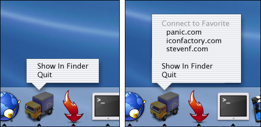
From a Fitts’ Law perspective, it’s faster to use this kind of dock menu to connect to a favorite server because it’s already right under your mouse. From a time–saving perspective, it allows you to spawn a new Transmit window in the background and have it connect to the server of your choice while you attend to other things; no application switching required. This might not seem like much given the question “what would you add to make Transmit even better”, but that’s my two cents. It’s just one more feature that gives Mac OS X a great big hug.
There’s been the usual media attention to Apple Records’ latest swing at Apple Computer, something I won’t bother getting into here (Google “Apple Beatles sue” if you need a gazillion news reports on the matter). What strikes me as odd, though, is the mixed bag of nomenclature being bandied about with regards to the two companies. Apple, as we know it, is Apple Computer. That much is certain. Apple Records, on the other hand, has been referred to as ‘Apple Corp’, ‘Apple Corporation’ and ‘Apple Corps’ in many of the articles I’ve found myself reading. Given the situation, let’s look at the two possibilities:
Given Mac journalists’ terrible track record with fact–checking, I think I’ll be going with number two.
Earlier this week Steven Frank made his bizarre RSS/HTML usage patterns known to the world, along with the complaint that “when you separate the words from the design, all blogs start to muddy together”. Brent Simmons was quick to respond, putting forth the idea of author–defined style sheets for RSS feeds… something that didn’t go down too well with, well, everyone. Personally, I have to side with the ‘againsts’ on this one; the power and appeal of RSS is in its simplicity. That, and there’s too much opportunity for the publisher to abuse the feed through CSS.
It would take literally zero effort to style an RSS feed with a background image so huge that all the bandwidth–saving advantages of syndication were moot. Likewise, a simple width statement could turn any blog into vertical–scrolling hell. So how do we deal with the visual monotony of RSS feeds without compromising the simplicity and user–friendliness inherent in the format? Brent wants to know.
Favicons have been suggested, something I agree would be quite nice, but has little effect on the appearance of the words in the feed. Also, given my habit (and many other peoples’, I’m sure) of grouping subscriptions into categorized folders, the favicons would soon be out of sight. Logos (or photos) have also been suggested, following in the footsteps of the favicon, but then there’s the matter of implementation; where in the hell does this logo go? FOAF is a great idea and an ‘Author Info’ panel would be great to see implemented, but as Mark Pilgrim has already discussed, there’s a wee problem in linking to your FOAF profile from your RSS feed. The solution to this ‘facelessness’ issue, I’ve decided, requires a simpler approach.
In adopting Safari’s WebCore to render HTML, Brent opened up a world of possibilities; allowing us to apply custom CSS to NetNewsWire by exploiting the .newsItemTitle and .newsItemDescription classes. All we need is one more class, wrapping the news items in a <div> whose class matches the site’s URI. Entries wrapped in <div class="inessential-com"></div>
Of course, there are the usual bugs to iron out of this idea. LiveJournal users, for example, would all fall under the .livejournal-com class, making them impossible to style individually. And, unfortunately, slashes can’t be used in CSS selectors, so it’s difficult to be more specific with the site’s URI. An id could be introduced referencing the author’s name to ease the suffering of LiveJournal users worldwide (and Mozillazine bloggers, for that matter), while allowing extra flexibility for group–edited journals. You could style .sixapart-com #anil completely differently to .sixapart-com #mena if you so desired, or you could set one style for .sixapart-com and have it apply to all authors.
Earlier today I stumbled upon an interesting article over at Macs Only! pointing out a little journalistic inaccuracy in PC Magazine’s G5 overview.
Yes, it’s great to see the G5 lauded for its speed and ability, especially from someone like PC Magazine, but that isn’t the problem; the problem is a misleading claim about the price of Apple’s hardware. For the longest time Apple has been branded the ‘expensive’ brand, the ‘boutique’ computer manufacturer, and for the most part that has been correct. I spent more on my first Macintosh than I did on my first car, if that’s any indicator; and though I am happier than ever that I became a Mac user in this glorious day and age, the price is… prohibitive… to many of the Wintel drones out there.
Still, that isn’t the point of this entry. The point is to debunk PC Magazine’s claim that similarly–specced G5’s and Xeons are also similarly priced. A quick trip to apple.com.au and dell.com.au confirms it, so here’s the raw data.
So what can we learn from this? That Apple has released a high–end workstation which, despite its ‘slower’ CPU clock speed, is “neck–and–neck with Intel PCs”? That despite its lower price, the G5 has faster RAM, a larger hard drive, a better operating sytem (subject to personal opinion, of course) and Apple’s famous industrial design to boot? Naw… I’m pretty sure we haven’t learned a damn thing.
From the AppleCare Knowledge Base:
This software updates Mac OS X 10.2.6 or 10.2.7 to version 10.2.8.
Important: This update works only with Power Mac G3- and G4-based desktop and portable computers, including iMac, eMac, and iBook. This update does not work with Power Mac G5 computers.
Given that 10.2.7 is exclusive to G5 systems, why (pray tell) would you tell us that the 10.2.8 updater will update 10.2.7… but won’t work with G5’s? Boy, I love tech support staff.
Just now I have disabled automatic <abbr>/<acronym> education in all RSS feeds. There’s no particularly compelling reason to do so, but whenever I fool around with the aforementioned auto–educating script it affects entries in the feeds… making many newsreaders believe something has been genuinely altered. It’s a pain in my ass when it happens, so it has been disabled. Additionally, through the magic of Mark Paschal’s EntryContents plugin for MovableType, I’ve added a little extra data for those of you on the “excerpts” feeds (namely the word count, link count, and image count. Beautiful).
Happy aggregating.
Despite the fact that decaffeinated dot org is, and always has been, composed of valid markup, I’ve never bothered (read: gotten around to) advertising the fact with any of those garish little buttons that seem so popular. I have, however, as of now, added such links to the very bottom of the page; site–wide. Feel free to validate anything and everything you come across. In addition, I’ve added links to Cynthia Says for accessibility testing; I’m privately hoping WaiZilla will be providing a web–based testing service when it’s done, since I’ve made my thoughts on Cynthia known before.
Aside from 508 compliance (which is surprisingly easy to attain… damned lazy US government) I’ve rated the site WAI Double–A compliant… though I’d kill for Triple–A. One personal point of contention for Triple–A is the concept of “ensur[ing] that all information conveyed with color is also available without color, for example from context or markup” being a little hazy to, uh… everybody in the whole fucking world. That’s priority 2 for images, 3 for text, and since images are largely inessential on this site I thought I’d avoid controversy (in regards to link colors… and lack of underlining) for now. On the flip side, “from context or markup” would seemingly make the importance of link color zero; links are marked up as links… obviously.
The thing that’s really keeping me away from a Triple–A rating is a lack of priority 3 tabindex and accesskey attributes throughout this humble domain… something the WAI demands for accessibility, obviously. I should really get on top of that. Interesting to note, though, is the disparity between the official WAI checklist and Cynthia’s own checklist:
…And Cynthia will display a warning unless all of the aforementioned elements have accesskey attributes. There’s a real difference between ‘important links’ and ‘all links’ which I’m afraid Cynthia just isn’t grasping; and once again I’m hoping WaiZilla proves to be smarter than Cynthia.
After that lengthy rant on Cynthia, WaiZilla, and just a couple of the subtleties of WAI Triple–A ratings (there are plenty more), I found it interesting to note that WaiZilla’s gracious hosts (otherwise known as Designory) claim Triple–A compliance on every page of their site… despite a complete and utter lack of tabindex and accesskey attributes.
Intriguing. I suppose the best part about claiming a certain level of accessibility is that there’s no hard–and–fast way of evaluating that claim. Right now, the human eye is the only half–decent tool for the job… and it’s not like the average end–user could be bothered combing through Designory’s code and running through the WAI checklist, could they?
Another no–no from these self–proclaimed accessible–design–whiz–kids is right there on their accessibility page; see that list of “disabilities that affect internet usage”? It turns out that it’s not a list at all, but a humdrum string of words separated by <br /> tags… a deplorable practice that has already been discussed to death over on the SimpleQuiz.
Aside from that, though, they’ve done a bang–up job with valid XHTML 1.0 Strict and valid CSS. More power to ‘em if they address that little boo–boo in regards to their accessibility rating.
I have spent my spare time over the last two days writing my personal statement (AKA “admissions essay”) to the University of Western Australia. Whilst all the happy little school leavers have a relatively simple time applying for a position in UWA’s Computer Science program, I (being a “mature age” student) have to write a goddamned essay. Without it, 10% of my potential entry marks (I assume the other 90% comes from the same place as those school leavers… the TEE) go up in smoke. The statement, which is basically a letter to the university, must detail my motivation, my past experience, ‘strategies’ I have in place that I plan to use in my studies (what the fuck does that mean?) and my opinion of my past academic achievement.
Well, as far as my TEE results go, I consider my past academic achievement to be pretty damned fine; I had a TER of 90.2 (the cutoff for Computer Science hovers around 80). Unfortunately, it’s the “enroll to Curtin University in a pissant degree/drop out/take a year off/re–enroll in the same pissant degree/drop out” that could reflect poorly on me.
Three years ago, as I was deciding which courses and universities I would like to attend upon graduation from high school, I made a simple decision; I decided that I didn't want to spend my working life behind a computer screen. In retrospect it was a foolhardy decision based on the assumption that, since I already spent a great deal of my leisure time on the computer, a career doing the same thing would chain me to my desk indefinitely. After three years and several false starts, I have come to realise that it would be foolish of me not to embrace this opportunity to transform a hobby that I love into an enjoyable and fulfilling career.
The rest of the statement is pretty much the same as the opening paragraph quoted above. Sucking up to the dean of admissions, going on and on about how dedicated I am to studying computer science (and, specifically, programming), talking at length about my ‘support networks’ and whatnot. I mean, it’s all true, but the way that make you write it seems to lack, well… dignity.
Now I’m off to post this sucker to the people in charge of my future. From there, all I can do is wait for January of next year to roll around to find out if I have a place at UWA. Yikes.
There’s a certain level of geekery you’ve achieved when you’re dancing in a nightclub on a Friday night, it’s three in the morning, you’re drunk as an ass, and you’re mentally describing the scene around you in XML.
Better yet, you try to formulate a regular expression simple enough (yet accurate enough) to pass to grep, thereby filtering the unsuitable women from the dancefloor. I make myself want to puke sometimes.
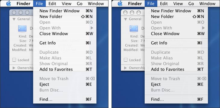
It’s been less than a week since I installed R. Galza’s ‘Panther’ theme for Jaguar, and suddenly the UI of a stock–installation Jaguar seems… jarring. Jaguar’s pinstripes feel too stark, its titlebar transparency too overzealous… in short, I’ve become an “I can’t wait for Panther” guy. Quick comparisons between Galza’s theme and officially–published (and unofficially–published) Panther screenshots show a close correlation; he or she has done a very good job. Quick comparisons between Jaguar and Panther (like the one below) are, again, jarring.
Of course, not having paid for my Apple Developer Connection membership I don’t have access to the developer seeds, nor was I at the WWDC; so this theme is all I have to cherish until 10.3 drops. Yes, I appreciate how lame that sounds. No, I don’t care.
I will say this, though: one of the greatest visual effects of Mac OS X (to my mind) is the window shadowing; the foreground window has a ‘higher’ drop shadow, indicating that it is ‘closer’ to the viewer than the background windows. In keeping with this stack order/distance analogy, background windows should be darker… as if dimly lit. Jaguar does a fair job with this by making its background–window–titlebars mildly transparent. More often than not, they inherit a degree of darkness from the desktop background they inhabit. Panther, however, has no such transparency and the background–window–titlebars are lighter than their foreground cousins, to boot. It is my humble opinion (and experience, given this last week of Jaguar–imitating–Panther fun and foreplay) that the practice of presenting foreground windows with titlebars darker than their background compatriots is completely counterintuitive; and though I doubt that Apple, in its magnanimity, will deign to alter their design decision any time soon, I sorely hope this changes before Panther’s gold master. That is all.
Now I sleep, for tomorrow we Western Australians celebrate the Queen’s birthday. And by “celebrate” I mean “don’t work”, even though I may still be working… hospitality ‘n all.